A Traditional Dining Room
Contributed by Susan Zaring of Material Girls.One of the first projects I decorated was a lovely home built in the 1880's with fantastic bones and detail throughout. The clients wanted to stay true to this aesthetic (the owner loves antiques and having a comfortable "lived-in" feel) but also wanted to create a space that was reflective of the architecture with a neutral palette and great flow since they love to entertain and gather in the space.
After
The dining room is quite unique with two sets of French doors - one looking to the family room and the other opening to a sun room - and most of the activity is spent in these areas so capitalizing on the abundance of light was a top priority. We first started with a paint palette to complement the adjoining rooms and chose Ralph Lauren Urban Loft: Architectural Cream, a go-to color that adds a clean crisp look to any room.
The client had pine chairs that we refinished and slip covered with a linen paisley print that was inspired off of an old print the client had. We found a beautiful pine table from a flea market in Virginia that was a brilliant bargain. It went perfectly with the chairs and complements the Oriental rug that was purchased at ABC Home. The rug was the largest investment but it definitely adds cohesiveness to the space and grounds all the pieces. We also refinished the pine floorboards to deepen the color and to add lasting texture. Lastly, the tableware and linens were purchased at a wonderful antique store called Old Lucketts Store in Leesburg, VA.
After
We actually spent a great deal of time rummaging through the flea markets in Virginia and found many great stores and this one in particular is a favorite. They offer everything from French provincial pieces, great items for the garden, and fantastic linens. The table top is completely characteristic of the clients; laid back and relaxed yet refined and classic. This dining room provides dual function for both entertaining and lounging. The client's seem to spend most of their time here now and have truly enjoyed the new changes.
Labels: after, before, decor, decorating ideas, design ideas, dining room, interior design, micasa, micasastyle, traditional
MicasaStyle's Design Spotlight - Master Bedroom
It’s time for another edition of
MicasaStyle’s Design Spotlight. This time around we’re highlighting a room with a slightly larger budget than last time, but equally amazing. We chose ‘
Master Bedroom’ by
mysweetsavannah because it truly embodies what a bedroom should be: a retreat. Her choice of colors, fabrics and décor create an inviting, peaceful environment perfect for a long night’s slumber.

As usual, we got in touch with our designer, Melaine, to find out just how she created this beautiful room. Simplicity and sophistication were her ‘must haves’ and we think she pulled it off. Her choice of neutrals and punches of black with a daring hint of animal print, give this room a clean, traditional look without being too shabby chic. But the real question here is how did she find all those great pieces to decorate with? Turns out, Melaine is a very thrifty shopper and has knack for bringing life back to old, unwanted pieces.

The bench at the foot of the bed was a flea market find and flows beautifully with the theme of the room. The chair in the corner was found at a thrift store and with bit of cream spray paint and a garage sale pillow it looks totally revived. And although the bed and one of the nightstands were purchased new, the matching nightstand was actually from a thrift store and Melaine painted and distressed it to match. You wouldn’t even know!
Of course, no room décor is complete without some crafty, creative touches from the decorator herself. One of the most eye-catching pieces in the room is the display of photos over the bed. All it took were some photo enlargements and a few $15.00 frames from IKEA and Melaine added a personal touch to her space. She also added a touch of whimsy with the ‘happily ever after’ sign she painted herself that is displayed above the photos.

We could go on about the embroidered and monogrammed pillows, the rich paint colors or the elegant cornices above the windows, but we’ll let the pictures and Melaine’s decorating talent speak for itself. In Melaine’s words, the whole room evolved over time and the pieces she used ‘screamed at her’, which we think is a wonderful way to create a space. A room, especially a bedroom, should reflect one’s tastes and style and by allowing the pieces to ‘find’ you, it creates a room the truly expresses oneself.
A special thanks to Melaine for letting us share her work. To see more of her room, check out
Master Bedroom at MicasaStyle.com.
Labels: bedroom, decor, decorating, decorating ideas, design ideas, feature, master, micasa, micasastyle, traditional
Creating A Vintage Kitchen In A 1950’s Ranch
Contributed by Liz from
Mabel's House.
Our house was built in 1952, a year when atomic fabric, turquoise appliances, and June Cleaver were at their zenith. Unfortunately, when we came into possession of our beloved ranch, the kitchen was less than exciting. Gone was the 50’s charm and in its place a dimly lit, gold painted den of claustrophobia.
After
The only source of light was a large flickering fluorescent fixture, which emitted a blue tinged hue onto the gold painted walls; creating a nauseating effect. To make matters worse, there was no pantry of any kind.
I began to collect pictures of kitchens like a woman possessed. I tore them out of magazines, downloaded them from the internet, and on one occasion I whipped out my ever present camera and took pictures of a friend’s kitchen during a dinner party. Apparently, obsession knows no bounds.
After
My first mission was to find breakfast area furniture. I began to haunt flea markets and yard sales. We purchased the hutch/shelf at an antique mall for $75 and painted it a crisp white.
The table and chairs were not as easy to find, but eventually I stumbled onto this set (a bit worse for wear with scratches and a burn mark, but solid oak) for a mere $65 at a yard sale. The woman selling them was getting divorced and these had been her ex-mother-in-law’s. She couldn’t sell them fast enough. As Tony Curtis said in
Operation Petticoat, “Where there is chaos there is profit.” I painted them to match the hutch.
We found pantry space in the broom closet next to the refrigerator. Then we chose a pale, dove gray wall color to brighten up the space and contrast with the white cabinets. It’s Seashell Gray by Valspar and available at
Lowes. It’s the perfect neutral; airy with a seaside cottage feel.
After
We replaced the large fluorescent fixture, choosing a stainless track light to compliment the stainless appliances. We also added a pendant light (also purchased at
Lowes) in the breakfast area. Never underestimate the difference lighting can make; it seemed to add another 100 square feet to the space.
As far as accessorizing, I used vintage bowls and pottery acquired from antique malls and yard sales. An inexpensive chalk board (the trim spray painted white) hangs near the fridge and pantry. In the breakfast nook window I hung lace café curtains (from
Wal-Mart) and an embroidered valance from an estate sale.
For more vintage inspired rooms decorated on a budget, please feel free to swing by and visit us at
Mabel’s House.
Labels: 1950, after, before, decor, decorating, decorating ideas, interior design, kitchen, micasa, micasastyle, ranch, vintage
South Florida Modern Condo
Contributed by Interior Designer, Lorrie Brown of My Design Secrets.This 3 bedroom condominium in South Florida was designed for a European client. The requirements for the project were unique because the client was going to be using the space himself as well as being used by international clients when he was away. So the two biggest challenges were to create a comfortable inviting environment in a small space and to develop a design that would be aesthetically pleasing to a number of people with different backgrounds and tastes.
The small foyer just needed some lighting and a mirror and small table to hold keys and sunglasses. This shallow table from Design Within Reach was perfect.
After
The living room is 15’ x 17’ and oddly shaped so we were short on space. My first goal was to unify the space with color. We painted the walls of the entire condo in Benjamin Moore Timothy Straw (2149-40) and we also installed very durable Berber Tuftex carpeting in a color that would not show traffic patterns. The wall color and flooring is a great back drop for the palette we planned on using which were white, black, brushed chrome and wood tones. I selected simple medium scaled furniture from Artefacto to make sure it did not overwhelm the room and left space to access the sliding glass doors to the patio. The ceilings are 9’ tall so we hung the drapery hardware from the ceiling so the draperies created some drama and the appearance of higher ceilings. We also installed Hunter Douglas honeycomb blinds inside the windows for additional privacy and to prevent fading of the furnishings.
The living room has Eastern exposure and has a lot of natural light so we chose the tripod lamp from Design Within Reach to create a sculptural focal point in the room and create a lot of great general light in the evening. Linen throw pillows from Crate and Barrel were an affordable accent to the sofa and gave me the opportunity to repeat the green tones in the room.
After
In the dining room I chose a round table to maximize space and to add some softness to a room that has many angles. The plant and the artwork from The Artful Home adds some personality to the space. I chose photography because I find that it appeals to a wider group of people than drawings or paintings. I chose this chandelier from Lightology because it has a very light feel to it and can be made larger or smaller for different looks. I also installed a dimmer for mood lighting.
Overall I was very pleased with the result of this project. I was able to design this space so that it felt larger and more modern in a short amount of time and the client was very pleased.
Labels: after, apartment, before, contemporary, decor, decorating ideas, design ideas, florida, interior design, micasa, micasastyle, modern
French Country Kitchen in Greek Revival Home
Contributed by Jean of Renovation Therapy (formerly I Love Upstate)
My house is a circa 1839 Greek Revival in upstate New York. I bought the house because it had great bones and incredible potential. I'd also been in love with this house since I was little so when it went on the market, I scooped it up.
From a style perspective, the kitchen was my worst nightmare. Faux green marble laminate countertop, electric cooktop and faux brick linoleum. Did I mention the green ivy that was painted around the edge of everything? Where to start? Anywhere! Anything would be an improvement in my book.
First things first, I found an incredible contractor; Matt Alexander. He understood me, he had great ideas, he worked around my lack-luster budget and he delivered. He also emailed me lots of pictures when I wasn't on site. I couldn't ask for a better contractor.
With the help of Matt Alexander, we ripped out the floor and took it right down to the subfloor. The floor was sanded, patched re-insulated from below and then we put down several layers of
Before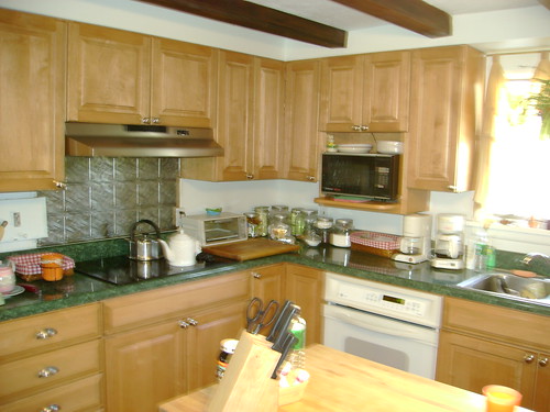
Ace Hardware's floor porch enamel called "Warm Scones". I was concerned that this would be hard to keep clean but a friend who is a decorative painter tipped me off that watered down Windex and a damp mop would do the trick. She was right!
Matt's team ripped out the ceiling in the laundry/breakfast nook area and we gained about 3 feet of space. We installed 4 recessed lights from Home Depot. We also had much bigger windows installed in this area
Before
and also across the room above the sink installed. They are Integrity by Marvin. Let there be light! While we were ripping out the ceiling we discovered a brick wall. I opted to not cover up the brick. It was funny having removed the faux brick linoleum to later discover a real brick wall!
I donated my old refrigerator to a local retired couple, their fridge had bit the dust and being on a fixed income, they were struggling to replace it. I was thrilled to help. My new refrigerator is from Lowes, it's a double door unit. I'm still not used to the whole double door thing. I suppose I'll come to love it in time. I also picked out the new gas cooktop at Lowes. I was able to supplement this purchase by selling the old electric one on Ebay.
The hardest decision was the countertop. I looked at granite, Corian, butchers block, zinc, pewter and on and on. I literally spent months agonizing over the counterop. I finally settled on butcher's block. I opted to purchase it at Ikea after reading several reviews from other bloggers
After
who had purchased Ikea's version. The price was incredible and the installation was very easy - and it matched the butcher's block on the island. Score! The backsplash is bead board from Home Depot.
The walls are painted Lowes' Valspar Laura Ashley Cowslip #1. That's a mouthful! The trim on the fireplace, doors and backsplash are Cowslip #4. With the help of 518's Finest Painting (another awesome contractor that I'm very pleased with!) we primed the ceiling beams. The beams required 2 coats of Kilz primer and we had to use the spray can version in a few spots to truly cover some
After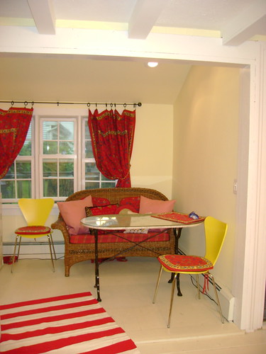
hard grease spots. Getting rid of the dark beams really made the room seem much larger. We also installed this great vintage faux bamboo lighting fixture, a total score on Craigslist.
The curtains are actually tablecloths from Williams Sonoma Home, I put them up with clips from the Thomas O'brien line at Target. Shhh. Let that be our secret!
Labels: after, before, country, decor, decorating ideas, french, greek revival, guest blogger, interior design, kitchen, micasastyle
French Country Cottage Living Room
Contributed by Pearl Sanborn, who has been sharing her secrets to living better for less at A Story Book Life.So far, my whole life has been an exciting journey of “re-creating” & “making-do”, so when I was given a brand new blank slate to work with, I almost didn’t know where to begin.

For many years, my husband & I worked at renovating a pretty little 150+ year old Victorian cottage. Then, by way of many blessings, 2 years ago we were able to build a brand new home not even a country mile away. It is tucked deep within the forest, nestled atop a grassy knoll, with a little river only a stone’s throw from the back door.
As it seems to be in many newer style homes, many of our spaces are open and viewable from several vantage points. This makes it a bit harder to plan your initial color scheme, as everything must flow together.
Downstairs we have 9ft ceilings in each room, but our entry is an open area and reaches approx 20ft. Because this area flows into our living room, there needed to be some sort of continuity between the two spaces. With a south facing window spilling sunshine into the entry, we decided to take that hint from nature & make sunshine and warmth our theme.
We applied old world plaster in the entry, and a deeper shade of sunshine for the living room walls. To give the room a pop of color, we covered the wall that would become the focal point in a red vintage style wallpaper from Home Depot.

I made the curtains using $3 per yard Waverly fabric that I found at Walmart. Then, I simply hung them up using some black iron hooks from JoAnn Fabric (the best prices!). (How to make
Country French Curtains)
To dress the space, we used pieces that were both vintage and new. We also made sure to use items of the same theme and color family to pull the room together.
As well as being one of our favorite places to sit, the
cottage sofa also adds to the overall décor with the beautiful mix of Country French colors, and cozy plush pillows.
One of my favorite pieces in the room is a large black cabinet that we found at a very high end furniture store. But because it was in the discounted area, we were able to pick it up cheaper than discount furniture store prices! I love how the basket of hydrangeas brings in a bit of nature.

A simple scattering of some of my favorite things here and there really dressed out the room and made it finally feel like home. And for the finishing touch… to remind us of how happy we are with our new home, we added a big picture of bears eating, playing music, and dancing at a picnic! I think I smile inside every time I look at it!
Although our relationship with this newer bigger cottage has only been 2 years in the making… we have already grown to love her!
Labels: after, before, decor, decorating, decorating ideas, design ides, guest blogger, interior design, micasastyle
Guest Post - Modern Victorian Master Bathroom
Contributed by Mindy Wagner, a Do-It-Yourselfer from Our Fixer UpperA bad 70's remuddle left much of our Victorian home in dire straits. Our master bathroom was cramped and dark. It had poor task lighting and only two electrical outlets. A moldy shower area and hideous shag carpeting did not help. Because there was little worth saving, we gutted the room right down to the studs and then built it back up using affordable materials.
Before
First, we bumped the back wall out about 4' so it did not feel crowded. This meant we lost a little closet space but it was well worth the trade. To give the room historic charm and make it feel like part of the original house we added 3' high beadboard. We also
built complex trim for the baseboards, windows and chair rail using standard lumber yard offerings. 3.5" tall crown molding finished the look and gave the room a sophisticated feel.
Before
The green wall paint (Sweet Annie from American Traditions, found at Lowes) looks crisp and clean against the clean ivory trim. We were happy to say goodbye to the shag carpet, replacing it with
Octagon and dot tiles and two green throw rugs to keep our feet cozy. We chose a charcoal gray grout for easier cleaning and less worries about staining. A $25 thrift store dresser was repainted using old-fashioned milk paint; a hole was cut in the top using a jigsaw to run the sink plumbing. After painting, the dresser was given two coats of
Cabot spar varnish to protect it from water damage. The vessel sink and
American Standard wall mount faucet give the room a modern touch.
To complete the Victorian theme, we had a clawfoot tub refinished by a local company and installed a chrome
shower enclosure and tub filler from Vintage Tub and Bath.

Visit
Our Fixer Upper for more details on the master bathroom project.
Labels: after, before, decor, decorating, decorating ideas, design ideas, interior design, micasastyle
Guest Post - Den Makeover
Contributed by interior decorating consultant and entrepreneur, Linda Merrill of Chameleon Interiors.This tiny room was part of a larger decorating project. My client was a busy single woman. This room had become nothing more than a large storage closet and was a sad waste of space.
Before
She wanted a space that was fresh and inviting, yet still classic and appropriate for a coastal New England home. The room itself was small - 10' x 12' - and needed to feel cozy without being claustrophobic.
To create an airy feel, we decided to go with a soft monochromatic look of cream walls (Benjamin Moore's Philadelphia Cream, HC-30) and cream linen sheers (
Pottery Barn Linen Sheer drapery panels in Ivory) and a cream/beige patterned area rug. These sheers come with a 10" deep hem. We chose to hang the panels upside down with the 10" hem folded over to create a valance effect. We simply purchased one size longer than needed so that we ended up with the right length. The panels were hung using clip rings onto wrought iron rods with a basket finial.
The area rug was actually a piece of broadloom that I had cut to the very specific size needs of this room. Going with a custom cut broadloom carpet works very well in spaces that require specific non-traditional sizes.
Once the shell of the space was taken care of, we had the furniture to deal with. This room was to be used as a tv/sitting room and given the shape and size, a small sectional sofa made the most sense. We selected
Pottery Barn's PB Basic Small Sectional in Cardinal Red brushed twill. The color really popped against the soft creams, adding a vibrant warmth to the room. The size of the sectional was perfect and fit in snugly.
My client had several pets. While the room was intended to be off limits to all the animals, it didn't mean they didn't show up in spirit. On the wall was an oil painting of the two dogs. After a lot of searching, I found the perfect fabric to make a couple of custom dog pillows. We loved the "ancestral portrait" feeling of this fabric and thought it added a humorous and personal touch. The fabric was from
Kravet, which is now discontinued. The other custom made box pillows were done up in a Kravet woven stripe called
Bohemian in deep greens, reds and gold, which tied the pillows to the dog portrait.
After

The rest of the furniture in the room was small antique pieces that my client already owned. The small scale and rustic feel of these pieces worked perfectly. The table and floor lamps were black wrought iron
"Twist Basket" from Hubbardton Forge.
While this is a fairly simple space - it was the attention to the details - the repeating basket weave motif in the hardware, well coordinated colors and personalized touches - that brought the whole thing together and made for the perfect, comfy space to rela
x in.Labels: after, before, decor, decorating, decorating ideas, design ideas, guest blogger, ideas, interior design, room makeover


